
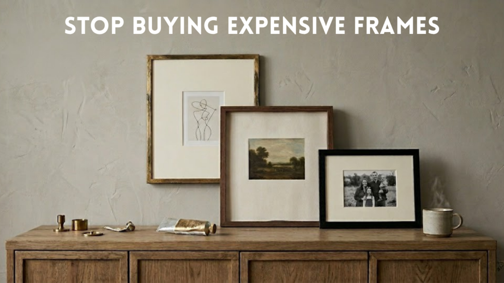
A few years ago, I took a simple fifteen-dollar print I found online to a local custom frame shop. I remember standing at the counter, looking at the two-hundred-dollar receipt, and feeling a weird knot in my stomach. It just felt like a trap, but I paid for the professional framing anyway because I thought that was what you were supposed to do if you wanted a home to look put together.
Then last year, while quickly pulling together a guest bedroom refresh on a tight budget, I ran out of money for the art. In a bit of a panic, I ordered a cheap pack of frames online and tried a few chaotic styling experiments on the living room floor.
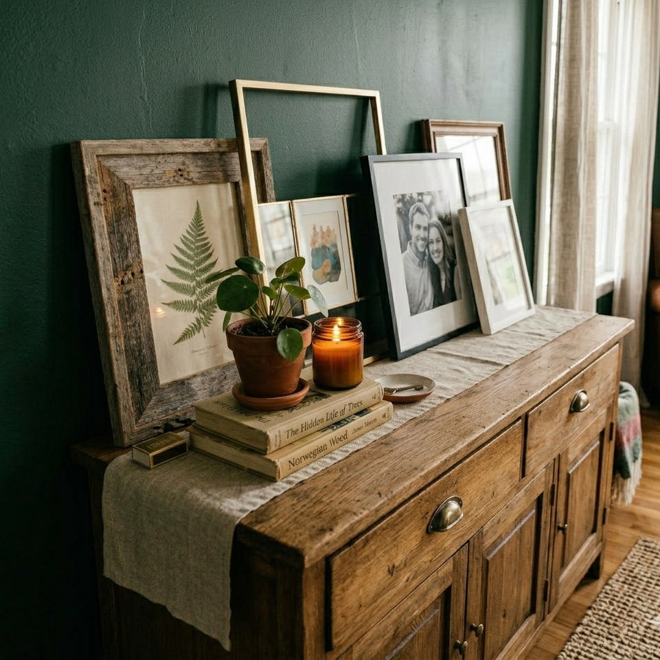
I didn’t expect it to matter all that much, but when I finally hung them up, nobody could tell they weren’t custom. I haven’t stepped foot back in a frame shop since. If you are looking for an affordable custom framing alternative, here is what I’ve noticed about making the cheap stuff look incredibly old, heavy, and personal.
The Scale Trap: Why Proportions Matter More Than Materials
I used to think high-end frame shops were expensive because of the solid wood quality. But after staring at my walls for way too long, I realized it’s actually a trick of proportion.
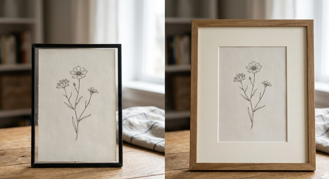
When an inexpensive frame looks cheap, it’s rarely because of the material. It’s usually just because it’s the exact same size as the print, making the whole thing feel crowded and a little flat. The rooms I kept saving on Pinterest for home decor inspiration weren’t using fancier frames; they were just letting the art breathe with proper matting.
What Worked: The Wide Mat Experiment
I used to just buy an eight-by-ten frame for an eight-by-ten print. It felt logical. But it always ended up looking like a retail display instead of a home.
This one surprised me: I started buying frames that were at least one or two sizes larger than my prints, and sourcing separate, wide mat boards to fill the gap. Putting a tiny five-by-seven sketch inside a massive eleven-by-fourteen frame completely changes the mood. It forces your eye to focus on the art and gives it this quiet, gallery wall weight.
A Quick Note on Mat Tones
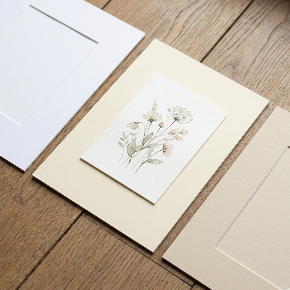
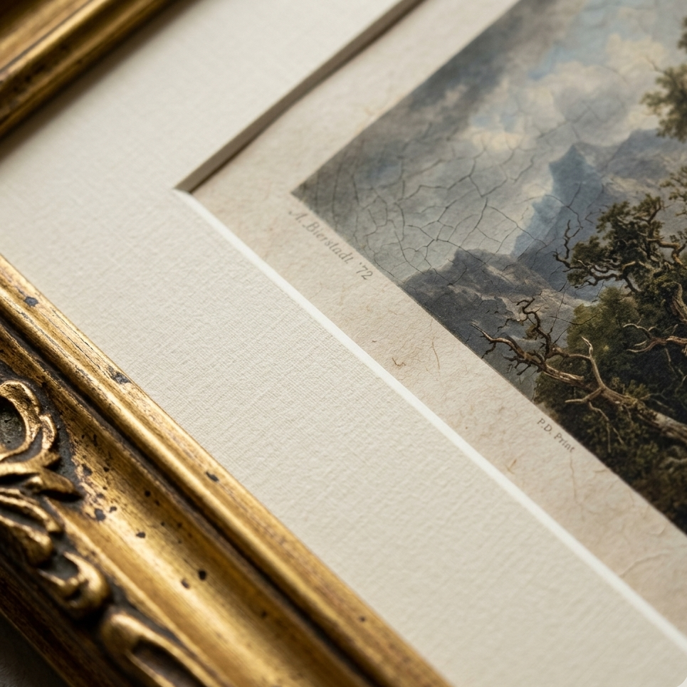
Also, those bright, stark white mats that come inside standard plastic frames always bother me. They feel a bit clinical when the afternoon sun hits them. I started swapping them out for warm cream or off-white mat boards. It’s a tiny detail in DIY picture framing, but it instantly makes everything feel softer and more historic.
Messing Up the Finish (On Purpose)
Anyway, if you buy those affordable metallic frames online, you know the exact disappointment when you open the box. They always arrive looking a bit too bright, uniform, and yellow.
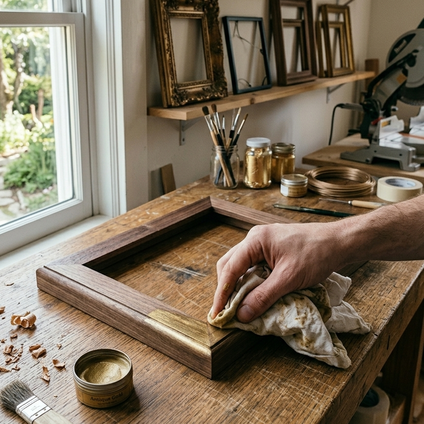
To fix that and make the frames look expensive, I started keeping a little tube of antique gold finishing wax in my kitchen junk drawer. I just rub a tiny bit over the frame’s edges with a dry cloth or my thumb.
I didn’t expect this to matter so much, but because the wax doesn’t coat the surface perfectly like spray paint does, it leaves these little irregular gaps. It builds a quick, tarnished patina that looks exactly like old brass you found at a flea market, completely hiding the shiny plastic underneath.
Taking the Fronts Right Out for a Tactile Look
This last thing was born out of pure frustration. A lot of budget picture frames use thin acrylic or plastic sheets instead of real glass. It keeps them lightweight, sure, but it also creates this weird, wavy reflection when the overhead lights are on. It drives me crazy.
For textured paper or canvas prints, I just started throwing the plastic fronts away entirely.
Leaving the frame open lets you actually see the texture of the paper. Without that shiny, cheap barrier in the way, the whole piece suddenly feels deeply authentic and tactile. The art moves a little over time with the humidity in the room, but honestly, I think that just adds to the charm of DIY home decor.
Things I Get Asked a Lot About This (FAQ)
Can you really make cheap plastic frames look like real metal?
I was skeptical too, but a coat of ultra-matte spray paint or a quick layer of metallic wax paste completely changes the texture. It kills that telltale plastic sheen instantly.
Where do you find mat boards that actually fit?
I usually skip the framing section entirely and buy pre-cut mat boards in bulk packs online. Just make sure to double-check the inner dimensions so your art doesn’t slip through the opening.
Is it worth doing this for cheap digital downloads?
Honestly, yes. The frame and the mat board do almost all of the heavy lifting. I’ve put two-dollar public domain prints into cheap Amazon frames with an oversized cream mat, and people always assume it’s an expensive vintage find.